Niall Corcoran, Managing Director of Dublin based agency Creative Inc sends us this place branding case study on Dublin, a project led by Creative Inc’s Creative Director Mel O’Rourke and senior designer Philip Mitton.
We are Dublin – Branding the City Centre
How to enhance the appeal of a city centre as a place for shopping, recreation and business development? Like many other cities, Dublin faces this question, wondering how to increase footfall and to improve overall trading performance.
A key challenge was that hardly anyone living in Ireland’s capital knew about the many people involved in enhancing their inner city, working together under the umbrella of the Dublin Town NGO (formerly Dublin City BID).
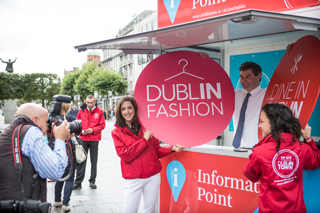
Despite Dublin Town’s successful website Dublintown.ie and high-profile activities, such as Dublin Fashion, Dine In Dublin and Dublin at Christmas, there was a lack of brand awareness with regard to Dublin’s City Centre that needed to be tackled.
Project Background
Because neither citizens nor consumers knew that Dublin City BID were the people behind these events and website and as such, they were not getting any of the credit for the great work they were doing.
Because the BID needed to also speak to the media about unfavourable Dublin issues, such as drug abuse and homelessness which they were tackling, they felt that speaking under the one brand may have serious implications for their more consumer focused events side. Creative Inc were therefore employed to advise and tackle this brand problem.
Identifying the Issues
Working with the senior executive in Dublin City BID we identified the name Dublin City BID as one major issue since it was perceived to be either some part of Dublin City Council or some sort of bid which the city was involved in. Neither were accurate.
There was confusion around what the organisation does, no public recognition or credit for its remit, no coherent tone of voice, no visible brand message or reason for being. There was also no visual link between the organisation Dublin City BID, its sub-brand DublinTown.ie and its activities Dublin Fashion Festival, Dine In Dublin and Dublin At Christmas.
Key Questions
In tackling these issues, we had to ask and answer a number of critical questions. Does Dublin City BID as an over-arching brand name help to convey the organisation’s function or remit and does it work with the Dublin Town website and the consumer activities it has set up and is responsible for? Should there be two brands?
A new organisational brand which communicates its remit and is easy to understand i.e. Better Dublin? And Dublin Town, the website which promotes Dublin City, its businesses, events and activities, brought to you by Dublin City businesses focused on making Dublin City a better place? Should there be one brand Dublin Town into which we build a bigger proposition than merely a website promoting Dublin, its businesses and activities?
Could we strengthen the visual links between the organisation, the Dublin Town website and the events to bring a more cohesive visual structure to the brand? In doing so, will this aid the organisation in gaining recognition for what it does and ultimately, will this brand awareness help entice the consumer into choosing Dublin City over other retail and night time destinations?
Solution
In the search for clarity and strength of message, it was apparent that a more unified brand structure made sense, where the core (the organisation) was more aligned to its sub-brands and activities. Therefore the decision was made with the executive, with the support of the board, to align the organization under one brand Dublin Town and to rename Dublin City BID to We Are Dublin Town.
In doing so, we created a distinction between the two entities; one being the consumer focused website http://www.dublintown.ie the other being the people behind the organization http://www.wearedublintown.ie/. A simpler message “Businesses Improving Our City” was created to bring more clarity to the organisation’s remit.
Identity
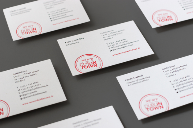
We decided to retain what was working well with the existing Dublin Town identity where the IN TOWN was highlighted. This formed the basis of the identity scheme, using simple typography to form the logo which could serve as a communication system where words could be added like Clean, Safe, Better to the logotype to constantly promote the remit of Dublin Town and its people.
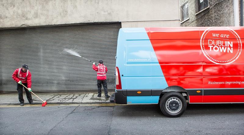
We developed more of a stamp for We Are Dublin Town that could be used on all the service providers merchandise. The We Are Dublin Town badge gave the users a real sense of community and pride for the great work they carry out on a daily basis.
A simple corresponding identity scheme was also created for each of Dublin Town’s activities which included set colour palettes based on what was already in existence. This aligned the full organisation into one streamlined identity which is easy to implement and is very visible on the streets of Dublin city centre.
Impact
The rebrand has had a hugely positive affect on the organisation, raising its profile and ensuring that all its activities are connected back to Dublin Town and the people behind it. The brand has become very visible throughout the city centre and most importantly, it has helped to strengthen the benefit of membership for all the businesses who support Dublin Town.
Thanks, Niall for sharing this case study on Dublin city branding.
For more about Niall Corcoran, his work for Dublin and other projects by Creative Inc, visit their website or follow them on Twitter.
Did you find this case study on City Centre branding in Dublin, Ireland, useful? Please spread the word!


