Natasha Grand, Director of the Institute for Identity INSTID in London, illustrates how her team helped to create a new visual identity for the “tough” city of Irkutsk in Siberia, Russia.
Irkutsk was tough. Tough nature: a city in Eastern Siberia, Russia, a seismically active zone, freezing in winter and scorching in summer. Tough people: descendants of aristocratic exiles, entrepreneurial merchants, ambitious scientists. Tough project: a place 7 time zones away. Tough, and powerful result.
“If aliens invade the Earth, let’s put Irkutsk in charge of resistance” – wrote a commentator to the review of Irkutsk graphic style on Brand New, world’s most authoritative graphic design blog. “There is a wild looseness to it but paired with a somewhat strict application that feels like, literally, capturing lightning in a bottle… and hoping it doesn’t explode.” – said Armin Vit in the review itself.
Irkutsk is a Russian city in southeastern Siberia with the population of 620 000 people. Established in 1661, Irkutsk has lived through the incarnations of a prosperous merchant city, a destination for political dissenters, and a centre for aviation, science and space industries. In its current form, the city is economically confused yet emotionally boisterous.
The Irkutsk tourism office does not have an easy job. Irkutsk is hundreds and thousands of miles away from major cities. For years, it relied on the tourist appeal of the nearby Lake Baikal, the world’s largest freshwater resource. The bulk of Irkutsk visitors were those in transit to Baikal.
The local tourism professionals, yet, had the love and ambition for the city and aimed to make it more internationally and nationally popular. INSTID won a public tender for branding Irkutsk, with the brief of making the identity fundamentals and a visual style for the city.
As with many cities, Irkutsk had certain objects and memes that the locals perceived as its ‘brand’: the traditional elaborate wooden window shutters, a totem animal babr, aristocratic political exiles, and the space industry credentials. Remarkable as these were in their own right, they would not warrant a substantial time and financial expense from a traveler.
Irkutsk: how to brand a tough destination
Most of the Russian population lives to the east of the Ural mountains and has access to closer, cheaper and better quality tourist resources in Europe. Irkutsk is not a place for a typical relaxing holiday, nor for a cultural trip.
What Irkutsk offers, instead, is the ability to be very close to the formidable, powerful, awe-inspiring nature: not the Baikal lake per se, but the terrain of a seismically active zone, the wild temperature fluctuations, the special phenomenon of having a wider span of observable sky and the ability to look deeper into the space. The nature affects the culture. Electricity is in the air, in the language, actions, ambitions of the locals. Everything moves, fluctuates, never stays the same, always growing, expanding.
The only meaning that Irkutsk can give to the people is that of the wild, life-changing, mind-boggling experience of being close to the elements, feeling the breath of gods, being purged, energized and charged by the space itself, and, having lived through that, become a bigger, stronger personality, a superhuman oneself.
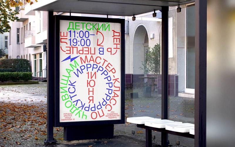
Visual style: intense, pushing boundaries
We created a visual style for Irkutsk that is very intense and uncomfortable. It is not pleasing or relaxing. It challenges one’s mind, pushes boundaries, and expands them both. It is a true reflection of the city and its nature. Anything ‘cuddly and cosy’ would be a lie and have no impact.
We produced a video clip with a Manifesto for the city, composed mostly of quotes from prominent locals. It calls on the people to ‘plug in’, get charged by Irkutsk energy. We made a series of photo posters themed as ‘Festival’. We created a custom typeface called ‘Rebel’ to reflect the nature of the people that were both physically and mentally robust and also very highly cultured and intelligent. We presented the style not to the client alone, but the general public and prominent residents.
Impact and reactions
The initial local reaction has been that of a shock. Some thought it was unbelievably brave and more advanced than they could have hoped for. Some felt they would have rather preferred a cuddly animal logo instead. The style seems so spontaneous some could not believe it took 4 months of “blood, sweat and tears” to create it (which is also a sign of good quality, conversely).
The Brand New Conference in New York named Irkutsk Brand as one of the most notable graphic design projects of 2017/2018 worldwide. The style started a trend and we have seen copycats in commercial advertising.
Brand Irkutsk inspired dedicated publications in non-design resources, such as Apolitical (a worldwide resource for civil servants) or Calvert Journal, a journal on policy and culture in Eastern Europe.
Media acclaim raised awareness of Irkutsk nationally and internationally, at zero promotion cost. Social networks show Russians and foreigners going to visit Irkutsk after they have seen the graphics and read the manifesto.
Whilst the government has very modest implementation resources, the visual style acquired local champions who take it further on their own initiative.
The city’s principal leadership arts and co-working center “Boiling Point” used the style in its interior design.
Developers for ‘Irkutsk Quarters’ historical area of the city adopted the brand values and design principles.
They were also followed in the ‘Sun Valley’ city park.
Young architects used the visual style principles to develop the style of the Irkutsk architecture forum.
A local jeweller created the ‘Irkutsk’ jewellery line, whilst branded T-shirts were made for the city marathon.
An Irkutsk native, a creative director for a major company in Moscow, wrote: “For the first time ever, I have seen a future for Irkutsk. The city grows due to strong people, who think not of logos, but of the environment altogether, and who are not afraid.”
By being brave and bold, the style gives Irkutsk residents the energy to be themselves, and to get the world interested.
More about the work of INSTID here and in our interview with Natasha Grand. You’d like to book Natasha Grand for your conference or event? Visit her speaker profile.
Enjoyed this illustration by Natasha Grand of how INSTID created a new visual identity for the “tough” city of Irkutsk in Siberia, Russia? Spread the word!