Natasha Grand, Director of the Institute for Identity INSTID in London, in this guest post tells the story of how Lipetsk, a region in southern Russia, (re)discovered its identity and turned it into a place branding strategy.
The work on Lipetsk region identity grew inconspicuously from a very practical task. Irina Belozerova, the head of a governmental tourism unit, was due to order a new range of promotional souvenirs. She did not quite like any of what their suppliers had proposed. Irina was also mindful of the annual national tourism show nine months down the line, the major event at which regions from all over the country competed to dazzle the public and the media. Irina wanted the Lipetsk exhibition stand to be the spotlight of the next show.
So she decided to start from scratch, and do things properly. She talked to her boss, the regional head of culture, Vadim Volkov. They reached out to colleagues in another region who run a very successful Visit Tatarstan campaign, and learned that the campaign was rooted in a comprehensive identity building project.
Vadim Volkov initiated a public tender for Lipetsk regional identity work. So many companies applied, and journalists inquired, that the department felt oddly popular. The tender went to INSTID on experience and qualification. It was September 2017.

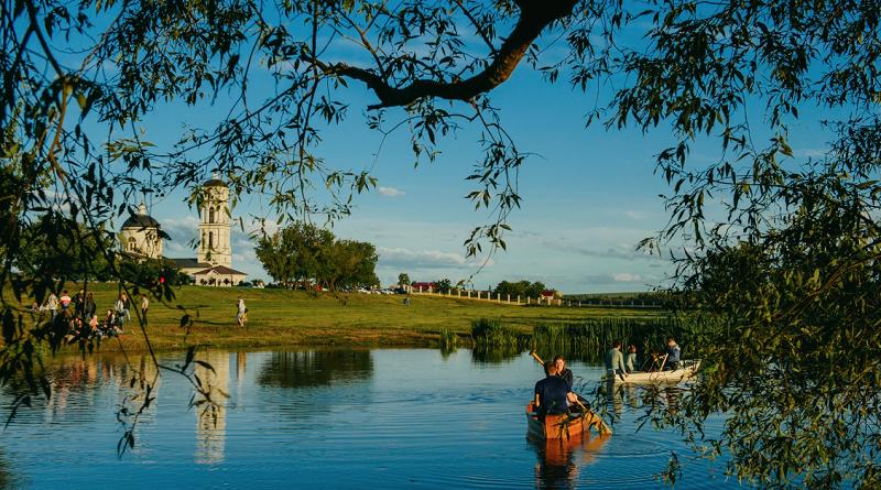
Lipetsk Region: population 1.2 million, location: south-west Russia, 400 km south of Moscow, size 24,100 km2 (comparable to Belgium), climate moderate, 20-21 C in summer and up to -10 C in winter, mostly flat surface with prominent rivers.
Before we started work on the Lipetsk region, we knew little more than the uniquely flavoursome name, which literally meant ‘the region of the Linden tree’, and romantic references to fruit tree orchards and large, green, aromatic apples from the Russian classics. Oh, and the world’s largest steelmaking plant next to the regional capital.
There were five of us: a researcher, an art-director, two strategists, and a journalist from the Guardian who was observing our work to write a longread. Together and separately, we explored the region. We talked to government officials, students, local history experts, large investors, old ladies, private tour and hotel operators, restaurant owners, graphic designers, lace-makers, journalists, farmers and downshifters from Moscow.
We saw innumerable museums, ate at a new restaurant each time without picking a firm favourite, visited craft cheese-making factory and the massive steel-maker plant. Irina’s driver submitted reports for over 1500km of roads covered throughout the region, including the place where Leo Tolstoy had died. In the evenings, we would gather in the hotel lobby and compare our notes.

Defining archetypal notions: the land and the sun
Our first job was to find what united everything and everyone we saw. The steelmaker plant, despite giving jobs and living to nearly every tenth local, originally seemed a plausible hypothesis. Yet, we soon dismissed it: no one talked about it, as if it did not exist in people’s mind at all. Instead, people talked with passion about their country houses and private harvests. We had other ideas, and kept mulling them over, until one saturated by the second field trip with assured certainty: the core notion for Lipetsk region and its people was the land.
As with any good theory, ‘the land’ suddenly illuminated and explained most things about the Lipetsk region: the vast swathes of countryside, the care and joy people felt from engaging with the nature, their tidiness and self-reliance, their natural confidence and the habit of minding one’s own business.
If ‘land’ explained the core values of the people, the ‘sun’ explained their character. The sun is always there in Lipetsk, golden and mild, never scorching. And so is the rest: the food with no strong tastes but lots of subtleties, the colours, natural and man-made, the gentle, innocent air about this region. The presence of innumerable churches and, more importantly, of local saints.
With archetypal notions defined, everything falls into place fairly fast: The core idea: ‘Sun in the palm of your hand’, from William Blake’s “Augurs of the Innocent”. The core messages: Purity, Serenity, Light, and the core character: Simple, Quiet, Warm, Soft, Solid.
Positioning Lipetsk region
Now to positioning. For visitors, Lipetsk Land offers a place to unwind, clear one’s mind amidst the peace and quiet and regain one’s creativity. For talent, it is a safe and stable place to grow and develop things that are genuinely important. For investors, there is a serious, committed workforce and effective government welcoming sustainable businesses.
This was an ideal image. The next job was to help bring it to reality: help develop more products and services, bring up service standards to match the model, create communication tools for the region – and make the locals themselves feel and interpret the image in their daily lives.
Creating the Lipetsk style
Lipetsk Land brand values, character, and visual style were presented to public at the end of 2017. The visual style included plain and decorative versions of the logo, with custom made lettering, a graphic sign in the shape of a linden tree flower, a meditative pattern, and several additional patterns and elements using the motives of nature and childhood. These all comprise a versatile took that can be used interchangeably without a logo to create a feel for Lipetsk Land.
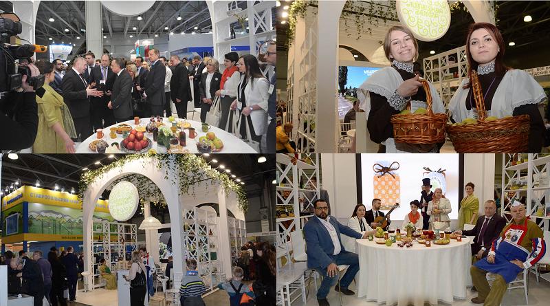
In March 2018, the Lipetsk Land stand opened at the ‘Intourmarket 2018’ national tourism show. Made as a light open garden pavilion, the stand did not ‘sell’ the region but created the experience of it. It offered a space of rest, to calm down and compose itself to any tired visitor. There was a caring hostess pouring linden tea into hand made mugs, natural foods including the famous apples, and meditative master classes. ‘Whoever stepped in, did not want to leave, but lingered on’, recalls Irina. The stand was the highlight of the show, receiving praise from visitors, government, and media attention.

More visuals and impressions here
Living the brand
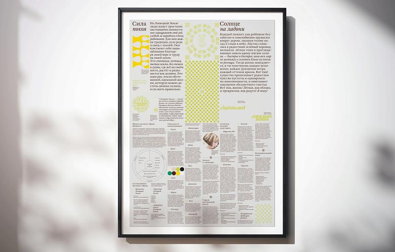
In April 2018, Irina’s department gathered over 30 local tourism officials from throughout the region to a day-long training on the values and implementation of the Lipetsk Land brand. Each went home not with a hefty brand book, but with an A3 poster summing up core points, to put on their office wall. They also had their personal plan of how they will implement brand values within their realm of responsibility.
The local crafts experts have enthusiastically adopted the new style and produced their interpretations. They are not in the brandbook, but that is the point: the style has got rooted and began its own life.
Irina’s department has started working with the hospitality sector on implementing service quality standards that reinforce the message of the brand.
Plans are underway for a major regional festival rooted in the idea of Land.

Irina does not need to worry about souvenirs any more. She has a wide choice of supplies, and she gives them out with pleasure. More importantly, she does not need to think of how to present her region any more. She and her colleagues have a common goal, a vision of the Lipetsk Land, and they work together to bring that image to reality. “When you have a clear vision, and great tools, and a plan, it takes your work to a whole new level”, – assures Irina.
More about the work of INSTID here and in our interview with Natasha Grand.
Enjoyed this example of how to develop, design and implement a regional identity and brand, in the case of Lipetsk region in Russia? Spread the word!


