What is the icon of Paris? If you answered ‘Eiffel Tower’, or ‘croissant’ then you answered the same as many others. And probably you would have got top marks on Family Feud, or any other trivia game show. You could also have said the Musée du Louvre, the Musée d’Orsay, or the iconic Place de la République.
Fact is these Parisians have had 2000 years to get city branding right. And a few époques as well. There was the pre-revolution Paris, post-revolution Tennis Court Oath, Haussmann Boulevards (which create height limits inside the CBD) – and so many other right decisions, made after so many wrong decisions.
It was trial and error.
So don’t worry if your city, council area or metropolis hasn’t quite got its icon yet, because sometimes it’s the small things.
It is the small things that make a city great, that brand it as a great place to live work and play.
I have been studying and visiting cities for over 10 years, and the data we have collected in the last few years for 2thinknow would blow your mind.
Right now, thanks to the folks at The Place Brand Observer, I am going to share with you some great lessons I learned from working on cities data. Observations which might help you make your city great as a brand.
You can learn from giants like Paris, or minnows in Japan. And as we learn, Paris was a minnow once. So we will look at history, and cities of different sizes. Then a foundational insight that clarifies it all.
Before we do, let’s try an experiment first, to get you into the right visionary mindset.
Picture your city
Picture your city, the city you call home. Picture it clearly in your mind.
What is the immediate icon of the city you picture? Is that icon generally positive or negative? For whom is the icon positive? Would the icon be a positive for a long period of time? i.e. timeless. There are many more steps to work out your iconic city (if you like, your best brand). And it may not be what you expect. It does need to be timeless, so as to allow the brand to grow. Timeless like the Eiffel Tower.
That last part is hard. Timeless may not seem timeless at the time. I have a model for predicting the impact of city branding elements versus trends, which is too long to go into here, but which I teach in courses. This allows better judgment in assessing the claims of something to be an icon.
The Eiffel Tower was once a temporary monstrosity
The icon of Paris was a temporary structure built by Gustave Eiffel, and at first widely panned as an eyesore. It’s true – what was once described as a ‘useless monstrosity’ of Paris in newspapers of the day, is now a great icon of tourism, if not the greatest. The Eiffel Tower was also scheduled to be dismantled in 1909.
Data compiled by 2thinknow show that Paris was ranked 8th among major cities in the world for international tourist numbers. The city is well branded in the tourism space, as the ‘City of lovers’, but before Gustave Eiffel, and Baron von Haussmann (under Napoleon III) Paris was a dirty stinking city of slums. It’s also notable that at this time, le Bon Marché, the first department store opened (and is still open today, as another Paris icon).
Paris was, prior to the construction of icons such as the Eiffel Tower, not the city we know and love. Like London, it once suffered from the Great Stink that plagued the Houses of Parliament.
The Eiffel Tower was not a planned masterstroke, rather an unplanned, unloved happenstance that became a symbol now central to the Paris city brand.
Melbourne and liveability (world’s most liveable city)
Back when Melbourne entered and worked on the liveability rankings (put out by The Economist and Mercer, two of the longest running rankings) such rankings where merely gauges for expatriates hardship pay – this indeed is their original purpose. Liveability does not literally mean best place to live, however, that is rather lost in translation in the media releases.
Melbourne has eclipsed the original ranking purpose, which has changed consequently. The liveability ranking itself has become part of the city brand of Melbourne, now on its way to becoming an iconic city like Paris.
This is because Melbourne is a collection of idiosyncrasies like Paris. The bars, the laneways, strange experimental restaurants and hipster food or bar ideas. They may not always be profit-making ventures, but they do make life interesting. The event and festival approach of the then Kennett government (and other State governments) led to a rise in Melbourne’s brand, which is now closely associated with sport, comedy, film, arts and fashion festivals.
Large expenditures such as the city logo (pages of a book) and a much criticised promotional video have been white elephants. The city council may well be amongst the last to actually see Melbourne’s brand (outside of the livability ranking which they do loudly trumpet).
The strategy of the rankings has worked to position Melbourne mentally as most liveable (and thus a must visit place). So the branding has worked but not because of the ‘big ticket spends’, rather the accidental and incidental aspects of a largely free ranking.
I would argue from the data, that a series of low-cost experiments within a city framework is nearly always better at finding icons to brand, than a single big-ticket spend.
From a city branding view, the experimental strategy has been a raging success, if sometimes by accident. Let’s look at some smaller cities, and small branding experiments that worked (before we look at some that don’t).
The Subway Cat
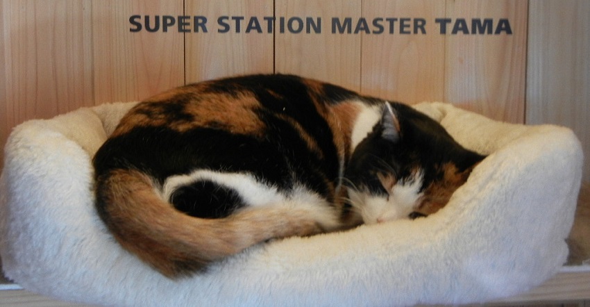
Tama, a cat, became the station master of Kishi Station, in part due to budget cuts that almost forced the closure of the line. The cat became an icon of the local area.
A study suggested that revenues to 2008 approached 1.1 billion Yen were attributable to the cat. The cat has since garnered apprentices, and the ongoing increase in ridership increased more than 10% in the first year (and more since then).
A cat became an icon of a local area of Kinokawa (which only has 70,000 inhabitants), and changed the viability of the railway line. Pretty big achievement for one stray cat among others.

The Selfie Statue
Now if you have never taken a selfie, you would be in the minority. Sugarland Texas may not be on your radar, at around 84,000 people – and is usually part of a larger Metro area.
Yet the city has become city branded for a seemingly innocuous action.
A statue of two females taking a selfie. Queue up $500 million plus in free media coverage, and increased domestic visitors (as a percentage) wanting to take a photo with the famous Selfie statue.
Rather than another me-too scheme, Sugarland, like Kinokawa, got creative, and captured a zeitgeist.
I would suggest this can be planned, but let’s build on this with a larger city with a perception problem.
Medellin SkyCar
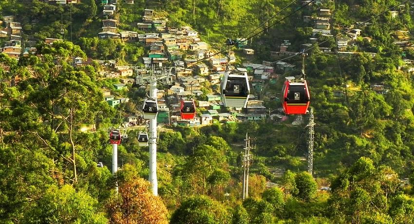
Medellin was infamous for its past history of violence. In recent times the Mayor had tried to brand the city as innovative, and overcome its past with a series of coordinated strategies.
One of the icons of this new Medellin, would be the cable car, which I believe should be termed the Sky Car, providing the necessary positive images.
Although a communication-led strategy has weaknesses, it is correct – a positive city image is the first step. Reality has to back up a city brand.

London and Innovation Economics
Moving up to a larger city brand, London has the opposite problem. Plenty of substance, plenty of icons (Big Ben, V&A, Westminster, Trafalgar Sq, Carnaby St) and a surfeit of city branding choices. Yet the brand has to be continually refreshed.
In our rankings London was number 10 in international visitors, and climbing fast. This is in large part due to refresh strategies that remind us of London. The clever use of the Queen and James Bond to promote the London Olympics, among other measures, helped reinforce the iconic city brand.
Las Vegas or Macau –Gambling Towns
Both Las Vegas and Macau punch above their weight, yet Macau ranks 4th in the world, with over 13 million international visitors (although one can make an argument that mainland Chinese are not technically international), fact remains the city is very successful (more so than Hong Kong on the same basis).
Globally top-notch gambling can create a city brand, but in reality this brand is expensive and slow to build. It’s not the optimal strategy, but remember Las Vegas was just nothing in the desert before the unlikely icon that was the Sands, and later Bellagio. At the time, it was an experiment.
Let’s go back to something so small, you have never heard of.
The Book Town
Clunes is a small town you may not have heard of if living outside of Victoria, Australia. A simple event, the Book Town annual festival, has become the biggest drawcard to this small town. A small, common and non-descript thing – books – helps market a small town.
Like numerous Italian festivals, these remain small and low-cost viable city branding strategies.
Mindset: Human Playground
There is a term 2thinknow have developed as part of our Innovation Cities Annual Report process. It’s called city as a ‘Human Playground’: a city where people are happy to live, work and play. A Human Playground has whimsy, it has fun, it has a keep-it-light city brand, that creates a certain perception of the city.
Yet many cities alienate visitors and residents, for example by putting up warning signs, such as don’t cross the tracks, you are banned from doing this, etc. Instead, try to evoke a playfulness. Whimsy and wistfulness are part of the game.
Indeed, those querying Melbourne’s liveability ranking would find that the main danger to it indirectly is a ‘preserving the ranking’ mindset, and time capsule thinking – trying to lock in the ‘Melbourne’ vibe. And Melbourne has way too many signs, rules and destructive design (such as those horrific transport super stops, that look like concrete bomb barriers disrupting passengers, cars and pedestrians alike.)
The best mindset for city branding is ‘playful’ – as a younger Melbourne once was (10-20 years ago), and Paris of the 19th century was also. Try and make the ideas come from within the city. Chances are you will need to try quite a few ideas before you find one that resonates with a community segment.
The worst thing you can do in city branding is to pick an icon, and say this is the brand we want for our city, as the brand has to be decided in part by consumer trends and wants.
Rather, keep it playful, light, experimental.
Make your city a Human Playground. Allow icons to emerge as part of a series of experiments. Paris and Melbourne did the same. It’s always the small (human) things which matter the most.
 About the author
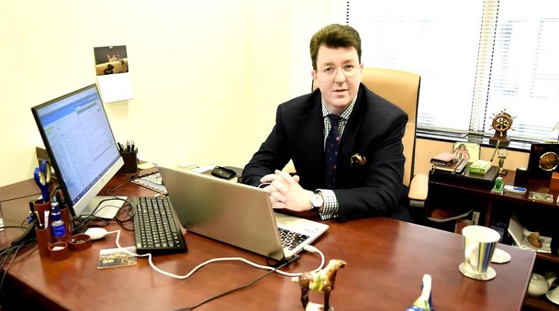
Christopher Hire is Director Data at 2thinknow since 2006, and creator of the Innovation Cities Program and City Benchmarking Data service. He oversees the innovation and city courses for place branding, informed by insights from 2thinknow’s city data. He plays a mean game of Monopoly, and will connect on LinkedIn.
Connect with Christopher Hire on LinkedIn or learn more about his work in our interview.


